
Redesigning how corporate banking users manage beneficiaries and payment templates — turning a one-account-per-person system into something that actually matches how businesses pay people.
CIMB is overhauling its online business banking platform. I'm on the team handling MVP3, which covers corporate payments. That's six payment types: CIMB transfers, domestic transfers, foreign transfers, collects, demand drafts, and cashiers orders. On top of those, I worked on the payment templates system and overhauled how beneficiaries are managed.
The platform came from Malaysia. By the time I joined, my colleague and the wider product team had already worked with vendors and stakeholders to drop the parts that didn't make sense for Singapore. So the groundwork was done. My job was to design within the constraints that were left and push for improvements where I could.
I've been on this project since September 2025. Most of the payment flows have been designed and signed off. This case study focuses on the two features I was most involved in: the beneficiary redesign and the template enhancements.
All the developers on this project are vendors. There's no sitting together and working things out on a whiteboard. Everything happens over Teams and through Figma annotations.
Early on, I spent a lot of time getting the developers to agree on a shared set of principles. How error states should behave. How validation works across different fields. What data the UI needs from the backend and in what shape. I annotated every screen in Figma with expected data, interaction details, and edge cases. Not just what it looks like, but what it should do and what could go wrong. When you're handing off to a vendor team and there's no chance to iterate mid-build, the annotations are the conversation.
The project runs waterfall. Requirements go in, designs get produced, then everything's handed off to development. That changed the way I thought. I had to get all the edge cases right upfront because I wouldn't have been able to catch them later.

The old system tied each beneficiary to one type of account. So if your vendor had both a PayNow number and a bank account, you'd need two separate entries for the same person. Two PayNow numbers — say a mobile and a UEN — also meant two entries. Same person, just scattered everywhere.
The transfer method was also baked in. When you saved a beneficiary, you were already deciding whether this was going to be a FAST transfer or a GIRO. That's not really how people think about it. You just want to pay someone. How the money actually gets there is something you figure out when you're making the payment.
We changed both. A beneficiary can now hold multiple accounts, even multiple accounts of the same type. Two PayNow numbers under one person is fine. A bank account and a PayNow together is also fine. And the transfer method moved out of the beneficiary entirely — FAST, GIRO, MEPS+ are all chosen at the payment stage now, which is where that decision makes more sense.
Another designer had started this work before I joined. I picked it up from there, groomed the requirements with the PO, and we ran small discovery workshops to figure out the edge cases. What happens when you delete one account but keep the others. How the accounts should be ordered. What info carries over when you add a new account to an existing beneficiary. These are the kinds of things that don't come up in a requirements document until someone asks.
These features don't live on their own. They're the setup for the payment flows.
Before making a payment, users can create a beneficiary with their accounts or set up a payment template with all the details filled in. When they go to make a payment, the form pulls from whatever they've already saved. Pick a beneficiary, choose an account, and most of the form fills itself.
It goes the other way too. After finishing a payment, users can save those details as a new beneficiary or template. The system captures what they just typed in and asks if they want to keep it for next time.
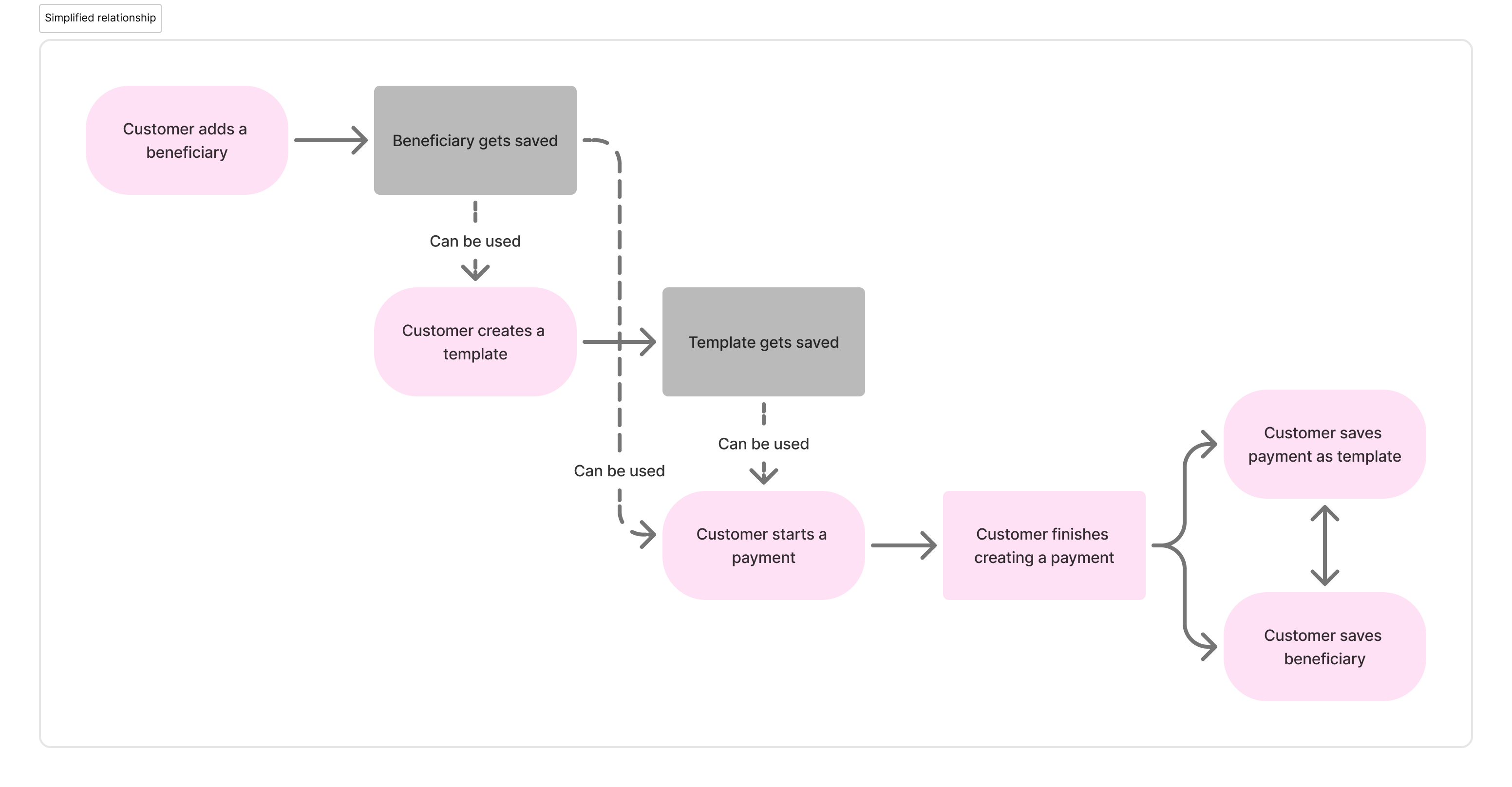
That two-way flow was important to get right. If creating a beneficiary felt like extra work with no payoff, nobody would bother doing it before their first payment. They'd just type everything in manually every time. The save-after-payment option catches those users and brings them into the system gradually.
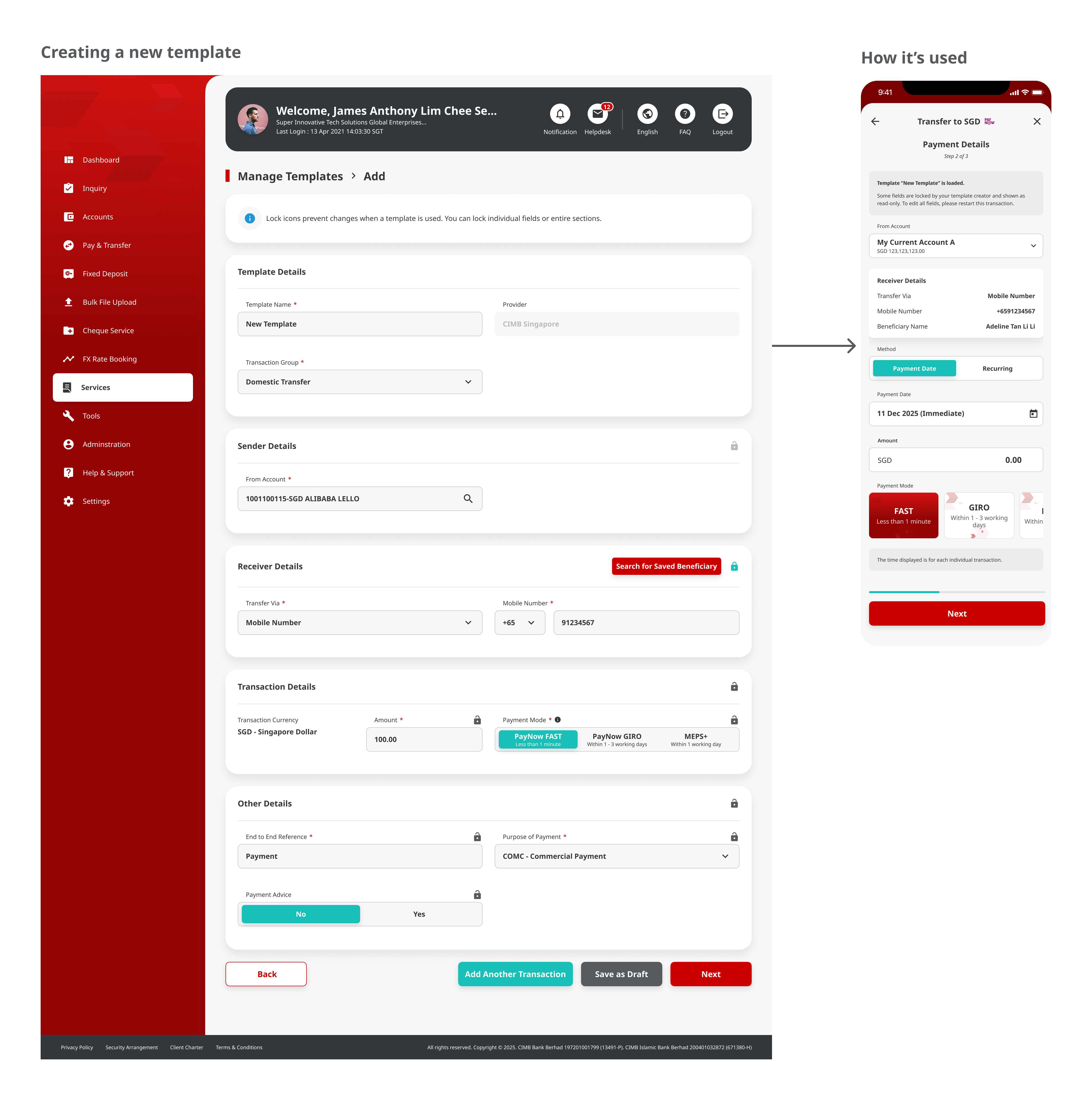
This is the enhancement I'm most excited about. Payment templates pre-fill form fields so users don't have to retype the same details every time. But the problem is trust. If anyone on the team can edit a template, the person who created it can't be sure the details are still correct when someone else uses it.
Template locking lets the creator lock specific fields. The data they entered stays fixed. Other users can still use the template and fill in the unlocked fields, but the locked ones can't be changed. It's basically saying "I've set this up correctly — use it, but don't touch these parts."
We ran a user testing session with a pilot tester who's been using the platform in production. When we walked her through the locking concept, she gave us a thumbs up and said "this one good." Just two words, but they landed. She got it immediately because she'd already lived the problem of not trusting templates that other people had changed.
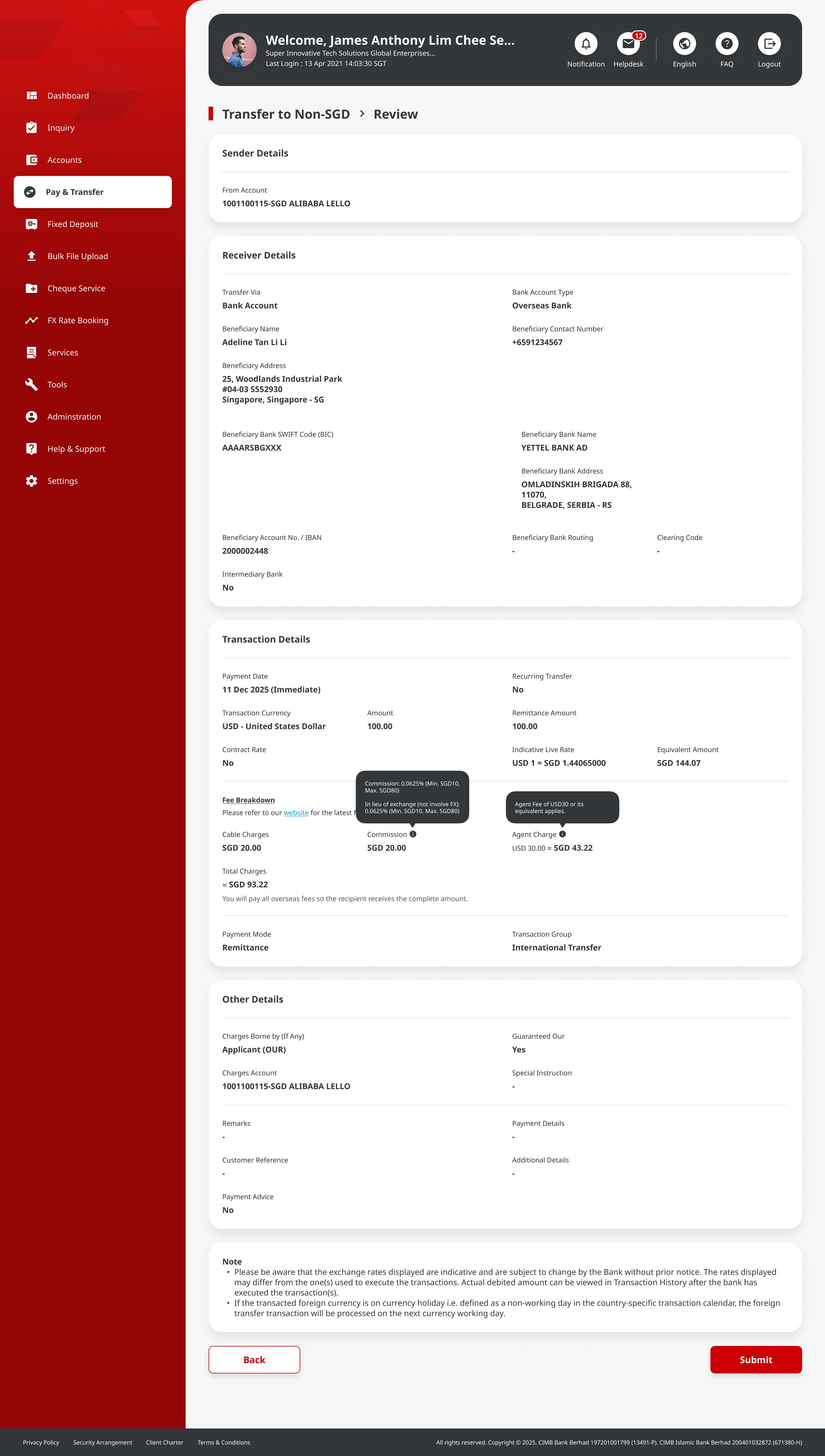
One of the bigger changes we pushed for was how foreign transaction charges show up. The old flow buried the fees. Users would fill out the whole payment form, submit it, and only then find out what the bank was charging on top of the transfer amount.
That's a trust problem. If you don't know the full cost before you hit confirm, every transaction feels like a small surprise.
We worked with the bank to bring the charges forward in the flow — showing them before the user confirms, not after. The argument was simple: people should know what they're paying upfront. The bank agreed.
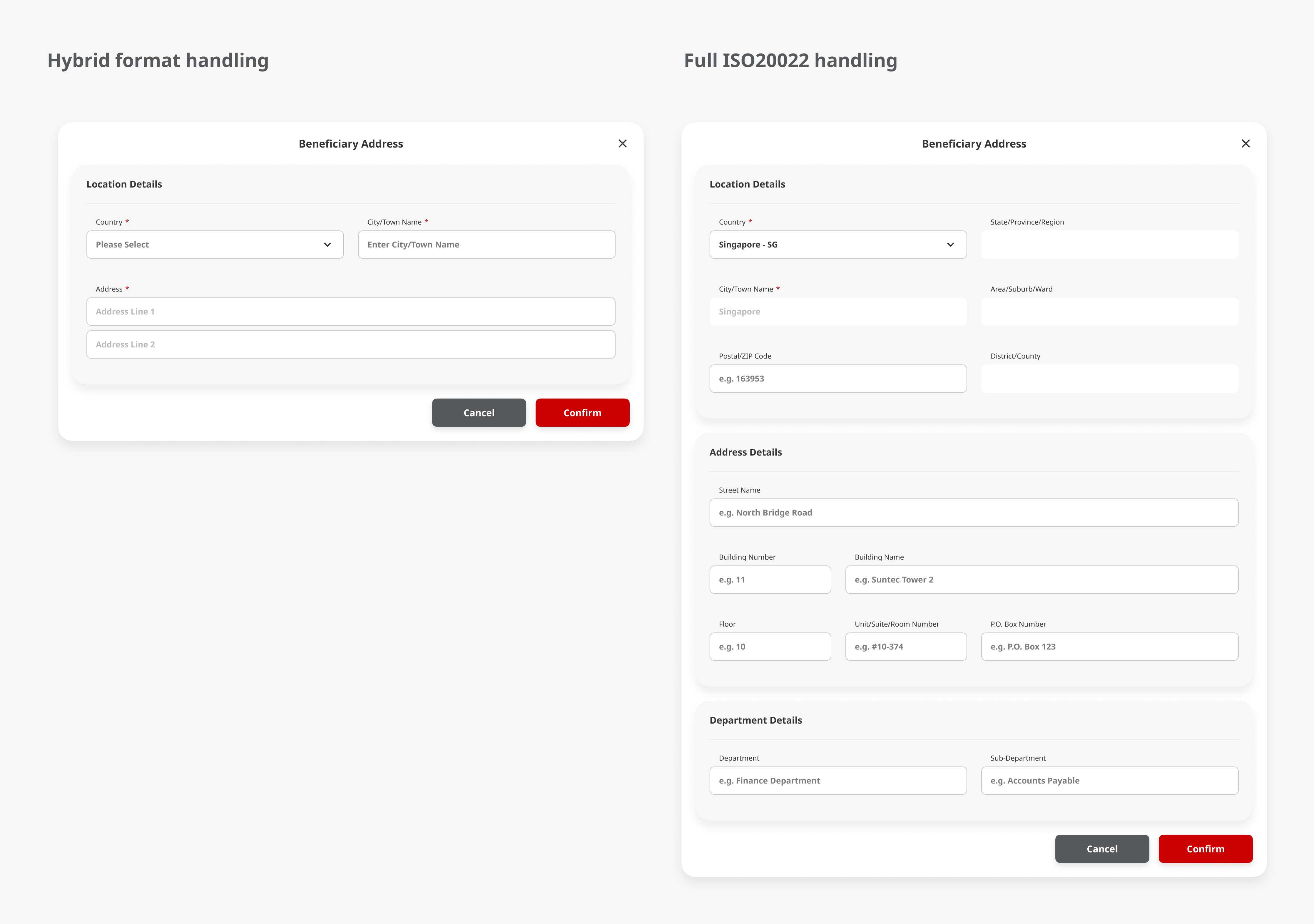
Foreign payments go through the Swift network. Swift brought in a requirement for more transparency on addresses — who people are and where money is going. They went with the ISO 20022 standard for structuring address data.
Singapore addresses are pretty straightforward. A few lines and a postal code. But the standardised format had to work for countries that handle addresses completely differently — states, provinces, building numbers that come after the street name, postal codes before the city. Every country does it their own way, and the form had to handle all of them without confusing users.
It sounds dry, but it turned into a genuinely interesting design puzzle once I got into it.
Designing for finance teams means respecting how they already work. These are people who process dozens of payments a day. They've been doing it on legacy systems for years and they know where everything should be by muscle memory. The new design has to be better than what they're used to, not just different.
Scope changes are just part of the job on a project like this. Requirements shift, priorities change, features get pushed around. You learn to document your decisions properly because someone will ask "why does it work this way?" months later, and you need a better answer than "I think we talked about it."
And working with vendor developers remotely in waterfall taught me that the handoff is everything. There's no sprint review, no standup, no "actually, I meant this" moment. The Figma annotations and the spec document are the only version of your thinking that reaches the people building it. If the annotation is unclear, the build will be wrong, and you won't find out until it's too late to fix cheaply.