What started as a component library for one team became the base for the company's enterprise-wide design language — built from scratch and maintained in sync with the developer codebase.
When I joined the digital transformation team at a financial services company, it was just me and my fellow design colleague. The team grew over time — designers came and went — but early on, every design decision ran through the two of us.
There was no design system. Each workstream built its own components and made its own calls on what things should look like. Any consistency across products was accidental.
The immediate problem was speed. Designers rebuilt the same patterns for every feature. Developers interpreted designs differently because there was no shared language between Figma and code. Every handoff turned into a back-and-forth about spacing, colours, and which version of a button was the right one.
We didn't start from zero. 2 developers and 2 designers looked at five existing component libraries before building anything. Designers compared them on how many patterns were ready out of the box. Developers looked at code quality, community support, and adoption rate.
We went with the developers' pick. Their reasoning was practical — better documentation, more active maintenance, and a structure that matched how they already wrote components. Some of the components didn't look exactly how we'd have designed them from scratch. But getting the system up and running mattered more than getting every detail perfect on day one.

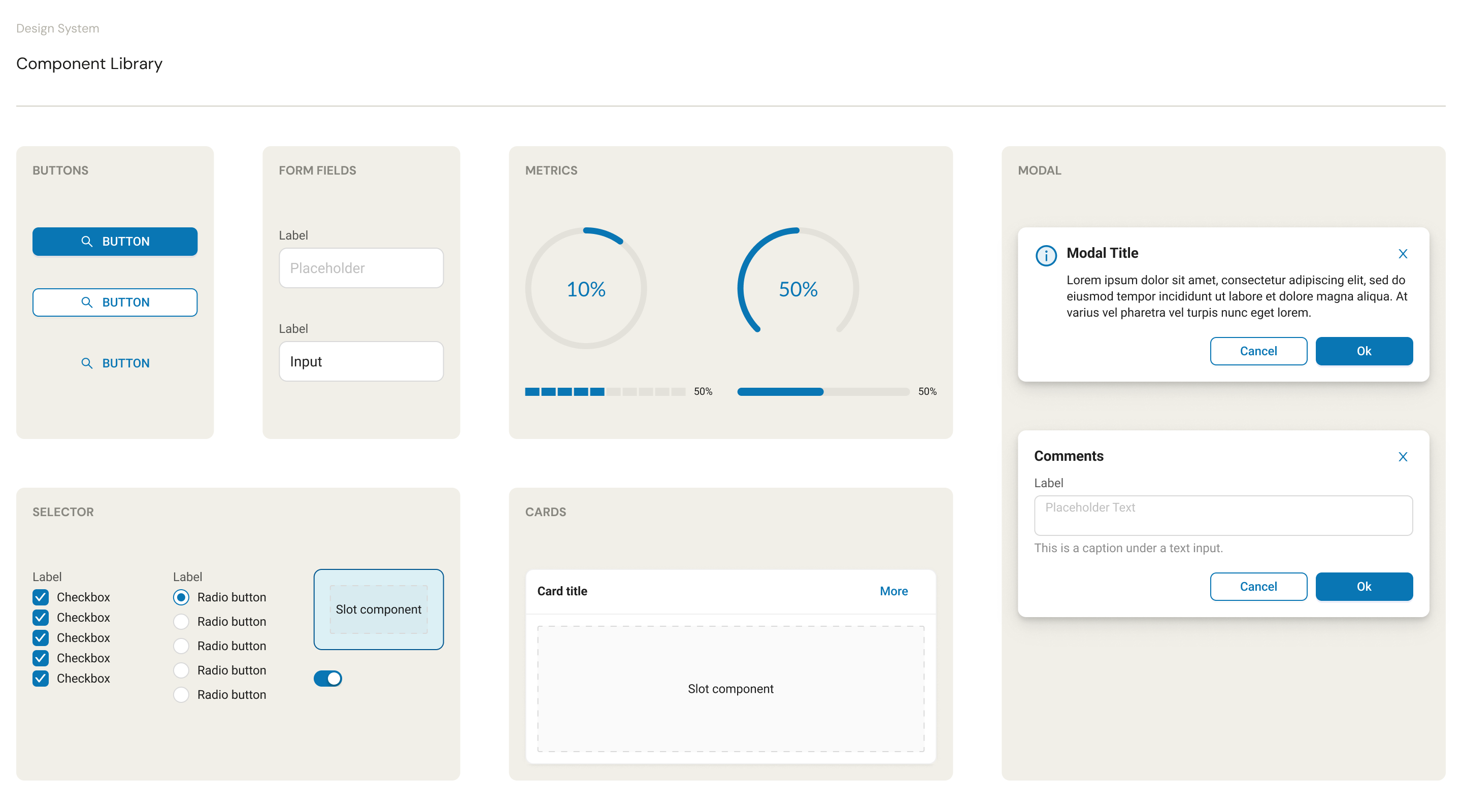
I was responsible for creating the components. Not all at once — I started with whatever the team needed that sprint and built outward from there. Buttons, form fields, data tables, navigation. Each one designed in Figma with variants that matched what the developers could actually build.
The collaboration with developers was ongoing. We sat together regularly. If they spotted something in their code library that wasn't in Figma, they'd let me know and I'd add it. If I designed something new, we'd talk through how it mapped to their component structure before I locked it in.

That way of working just became how the team operated. Nobody formally introduced it. It happened because the system needed both sides to stay in sync, and the easiest way to do that was to sit together and work it out.
This was built around the time Figma released local variables. I didn't have much experience with design tokens or writing JSON files before this. I learned as I went.
The tricky part was that developers needed tokens in their codebase that weren't useful to designers. Spacing multipliers, breakpoint values, animation curves — stuff that matters in code but would just be clutter in a Figma file. So we kept two layers. Figma stayed lean with only the tokens designers needed. The JSON we handed to developers had everything, theirs and ours.
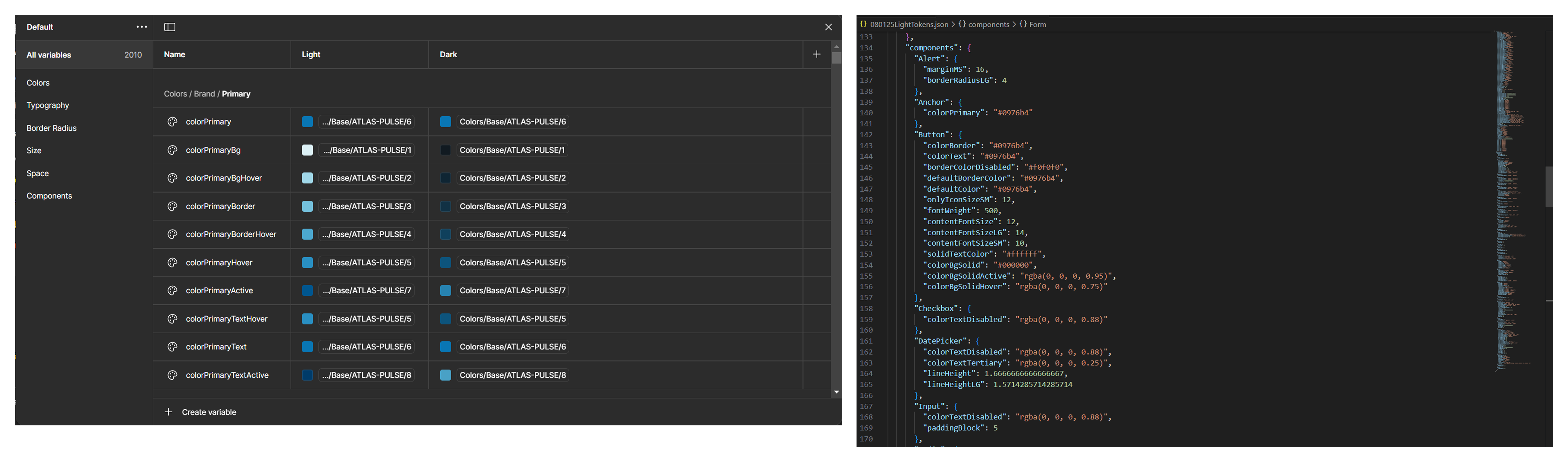
It wasn't elegant. Ideally you'd have one source of truth. But with the tools we had at the time, two layers that mapped to each other was the most practical option. The important thing was that "surface-primary" in Figma pointed to the exact same value the developer used in code.
Components on their own weren't enough. The team needed to know when to use what. So we built guidelines together through group discussions. When do you use a modal vs an inline expansion? When does a table need pagination vs infinite scroll? Those conversations became documented decisions that anyone on the team could look up.
Once those were in place, designers could just plug and play. They stopped asking which component to use or how something should look. The system handled it. When I built a feature end to end using the system, it shipped with fewer than five UI bugs. That number used to be a lot higher.
This part wasn't planned. The design lead heard about what we'd built and decided to compare design systems from different teams across the company. Each team had put together their own components, and leadership wanted to pick one to standardise on.
Ours got selected as the enterprise foundation. The components, the token structure, and the governance model all carried over.

What I've thought about since then is what "enterprise adoption" actually meant. The components transferred fine. The reasoning behind them mostly didn't. Other teams could use the building blocks, but the thinking — why this variant exists, why that token is named the way it is — stayed in our heads. The components scaled. The context didn't.
I'd document decisions as they happen, not after. We made hundreds of small calls while building the system. Naming conventions, variant structures, spacing scales. All obvious to us because we'd been there. Not obvious to anyone joining later.
I'd demo the system to other teams earlier. It was ready before anyone outside our team knew about it. The design lead found out through word of mouth. A few show-and-tell sessions earlier on would've sped things up.
I'd try to solve the two-layer token problem properly. Keeping Figma and JSON in sync manually worked, but it was fragile. If someone updated one and forgot the other, things drifted. A proper token pipeline would've been worth the setup cost.